The Ready Family of Educational Apps
A unified suite of exam preparation platforms designed for Australian students. Built on the warm, muted tones of the Catppuccin Mocha palette for comfortable learning environments.
Opportunity Class Preparation
Helping Year 4 students prepare for NSW Opportunity Class placement tests with confidence.
National Assessment Preparation
Building literacy and numeracy skills for NAPLAN success across Years 3, 5, 7, and 9.
Selective School Entry Preparation
Comprehensive preparation for Year 6 students aiming for selective high school placement.
Brand Philosophy
Catppuccin Mocha Foundation
Built on the soothing, warm tones of the Catppuccin Mocha colour palette. The dark theme reduces eye strain during extended study sessions whilst maintaining excellent contrast and readability for young learners.
Distinct Brand Identities
Each brand uses a signature Catppuccin accent colour: Blue for OC Ready (opportunity and calm), Peach for NAPLAN Ready (warmth and energy), and Green for Selective Ready (growth and success).
Catppuccin Mocha Palette
The warm, muted tones of Catppuccin Mocha provide a comfortable dark theme for extended study sessions. Each brand uses distinct accent colours whilst sharing the same harmonious base.
Blue
#89b4fa
Lavender
#b4befe
Sapphire
#74c7ec
Sky
#89dceb
Teal
#94e2d5
Crust
#11111b
Mantle
#181825
Base
#1e1e2e
Surface0
#313244
Surface1
#45475a
Surface2
#585b70
Overlay0
#6c7086
Overlay1
#7f849c
Overlay2
#9399b2
Subtext0
#a6adc8
Subtext1
#bac2de
Text
#cdd6f4
Success (Green)
#a6e3a1
Warning (Yellow)
#f9e2af
Error (Red)
#f38ba8
Brand Logos
Each brand features a distinctive logo mark using Catppuccin Mocha accent colours against the warm dark base.
OC Ready
The circular aperture represents opportunity and completeness. Catppuccin Blue conveys calm focus and clarity, whilst the Sky accent suggests forward momentum.
NAPLAN Ready
The stylised "N" with measurement bars represents literacy and numeracy assessment. Catppuccin Peach brings warmth and energy, with the Red accent for achievement.
Selective Ready
The shield/crest motif represents academic excellence. Catppuccin Green symbolises growth and success, with the Teal checkmark conveying achievement.
Favicon System
Optimised favicon designs using Catppuccin Mocha accent colours for instant brand recognition across all platforms and sizes.
- • Catppuccin Blue (#89b4fa) primary
- • Sky accent for depth
- • Base colour for contrast elements
- • Catppuccin Peach (#fab387) primary
- • Red accent for achievement marker
- • Warm, energetic feeling
- • Catppuccin Green (#a6e3a1) primary
- • Teal checkmark accent
- • Shield motif for excellence
<!-- favicon.ico for legacy browsers -->
<link rel="icon" href="/favicon.ico" sizes="32x32">

<!-- SVG favicon for modern browsers -->
<link rel="icon" href="/icon.svg" type="image/svg+xml">

<!-- Apple Touch Icon -->
<link rel="apple-touch-icon" href="/apple-touch-icon.png">

<!-- Web App Manifest -->
<link rel="manifest" href="/manifest.webmanifest">Educational Icon System
A consistent set of icons designed for educational contexts, optimised for clarity at small sizes and adaptable to each brand's colour scheme.
Maths
Mathematical operations and problem-solving
Reading
Reading comprehension and literacy
Writing
Written expression and composition
Thinking
Critical thinking and reasoning
Progress
Learning progress and loading states
Achievement
Awards, badges, and milestones
Timer
Timed tests and practice sessions
Practice
Practice tests and exercises
Stroke Weight
All icons use a consistent 2px stroke weight at 24×24px base size. Scale proportionally for different sizes.
Corner Radius
Rounded corners match the brand's friendly aesthetic. Use 2px radius on corners for consistency.
Colour Application
Apply brand primary colour to icons. Use muted foreground for inactive or secondary icon states.
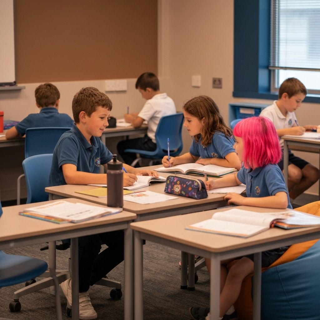
Hero Image Concepts
Visual concepts for hero sections that communicate each brand's unique value proposition whilst maintaining the unified family aesthetic.
Main landing page hero featuring confident students with abstract learning elements

Diverse group of students representing different NAPLAN year levels
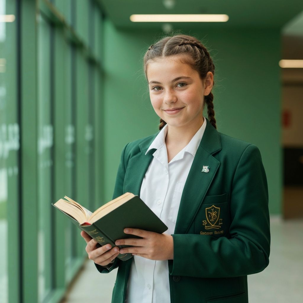
Ambitious student with excellence-focused visual elements
Composition Rules
- • Use rule of thirds for subject placement
- • Maintain negative space for text overlay
- • Eye-level or slightly elevated camera angles
- • Shallow depth of field for focus emphasis
Subject Guidelines
- • Feature diverse, authentic Australian students
- • Capture genuine expressions of focus, joy, achievement
- • Include subtle educational elements (books, devices)
- • Avoid overly staged or stock-photo aesthetics
Lighting & Colour
- • Natural, soft lighting preferred
- • Apply brand colour tint in post-processing
- • High key imagery for optimistic tone
- • Avoid harsh shadows or dramatic contrast
Environment
- • Clean, modern learning environments
- • Home or school settings appropriate
- • Minimal visual clutter in backgrounds
- • Australian context indicators where appropriate
Type System
A clear, readable typography system optimised for educational content and suitable for both children and parents.
Inter
The quick brown fox jumps
JetBrains Mono
1234567890 × ÷ = + -
Used for mathematical expressions, code snippets, and numerical data in practice tests and results displays.
Score: 85/100
Time: 12:34
Readability
- • Minimum 16px for body text
- • Line height of 1.5-1.6 for paragraphs
- • Maximum 75 characters per line
- • Sufficient contrast ratios (WCAG AA)
Young Readers
- • Clear letterforms without ambiguity
- • Adequate spacing between letters
- • Avoid justified text alignment
- • Use left-aligned text for reading flow